
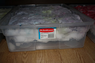
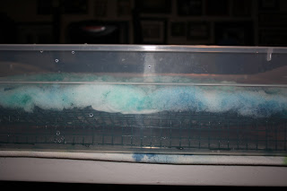
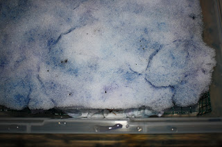
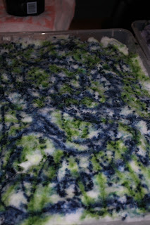
I just thought I would share some before and after photos of my snow dyeing. I like the look of snow dyed fabric, Monet-like. In light colors, it reminds me of marble. I think it makes a great background fabric. When I snow dye, I place wet soda soaked fabric (recipe: 1/2 cup soda ash to a gallon of water) on top of a rack or screen, inside of a tub. The purpose of the rack or screen is to hold the fabric off the bottom of the tub. The purpose of the tub is to collect all the water from the melting snow. I currently like using plastic storage containers with either a bakers rack on top of 4 oz plastic containers, a thin metal fencing cut and bent to fit inside the storage container or screening suspended inside of the storage container using binder clips to hold it around the sides. Here are a few pictures from during the process so that you can see how I set up the racks and stuff...
After placing the soda soaked fabric on the rack, I shovel and pack about 3 inches of snow on top. Add your dyes on top of the snow, like making a snow cone. Then watch the snow melt. A couple of things to keep in mind with snow dyeing:
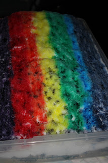
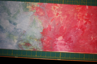
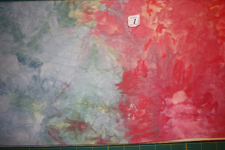
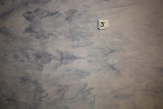
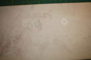
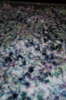
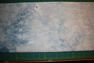
Below are the before and after photos of tub #1, rainbow stripes of color, full strength (5% solution). I sprinkled a little bit of gray at one end to see if it would make a noticeable difference. The resulting fabric is below: In the second photo of the fabric, you can see some markings from the rack. While the picture doesn't show the entire piece, the colors at each end are similar to what is shown. The gray end is not that noticeable in this fabric.
- Snow melts around the edges first, and some times the color seems to wick to the center.
- I recommend checking the fabric during the process.
- If you see the edges peeking out from under the snow without much color, move some colored snow from the center out to the edges.
Below are the before and after photos of tub #1, rainbow stripes of color, full strength (5% solution). I sprinkled a little bit of gray at one end to see if it would make a noticeable difference. The resulting fabric is below: In the second photo of the fabric, you can see some markings from the rack. While the picture doesn't show the entire piece, the colors at each end are similar to what is shown. The gray end is not that noticeable in this fabric.
Below is tub #2 before and after. In tub 2, I used blue (full strength), light blue (watered down), green and sprinkled a light orange over the entire piece.
Tub #3 (below) I used blue, lt blue, gray, pink, and purple.

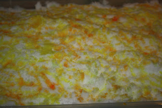
Tub #4 (below) is pale (really watered down) orange, pink, Lt green, lt blue, gray and pale green.

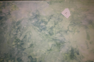
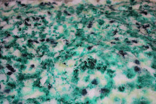
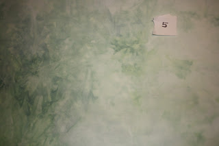
Tub #5 (below) is green, It green and teal.
Tub #6 (below) is Lt yellow, lt gold, and a sprinkle of lt green.
Tub #7 (below) is gray, lt blue, lt green, lt yellow, pink and lt purple.
Tub #8 (below) is teal, lt blue, blue, lt teal, and lt purple.
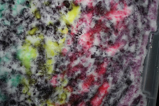
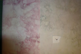
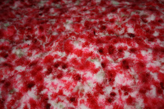
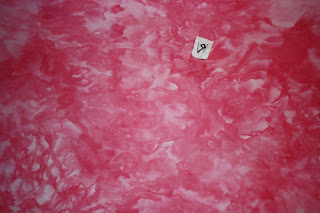
Tub #9 (below) is Pink, Red, dk red (red with a little black added), lt green, lt yellow. By adding a complimentary color, I was hoping for some neutral/tan-brownish areas.
Tub #10 (below) are leftovers... blue, teal, green, yellow, pink, heavy sprinkling of gray.


As you can probably tell, I mix by eye and don't use recipes much. So when I list the color itself (ie, blue), that means I used it straight out the dye stock (5% solution). If it said, light "color" or pink, it was watered down some. I didn't not measure. Guessing from the 4 oz cups that I mix in, 1 oz of dye stock to 2-3 oz of water. Pale meant even more watered down... using some "light" dye and adding more water.
 RSS Feed